A quick History of Sonic
The first sonic game Sonic the Hedgehog came out in 1991 on the Sega Mega Drive, it was immensely successful and helped Sega become a leading video game company during the early to mid 1990's. Due to it's popularity a sequel was soon made in 1992 followed up by a steady stream of games up to the present day.
All games include a few recurring themes, such as collectable rings. When holding at least one ring you can survive damage from an enemy or dangerous enemy, instead of a health bar or something of the sort going down though, you lose rings which are scattered around you. You can re-collect the rings but they soon disappear. If you have 0 rings and take damage, it is a game over. Certain things like falling off a cliff, being crushed, drowning ect. cannot be avoided, even if you have rings you will still die.
Other recurring things in the games involve chaos emeralds (usually collecting these is the aim of the game) special stages and special transformations.
Sonic Heroes
Sonic heroes came out in 2004 for the PlayStation2, xbox, GameCube and Microsoft Windows. Unlike most sonic games instead of just playing as Sonic you play in a team of three and you can freely switch between them in game play. In each team there is a flying caracter, a strong character and a fast character. Each character can do a varity of things the others can't, and in gameplay you have to switch between the characters to complete certain parts (for example you may have to play as the flying character to reach a high ledge, then switch to the strong character to break down a wall ect.) The logo of the game is based of the interface on the screen to show what character you are playing as. Is is made up of three circles, one representing each of the 3 team members (blue = speed character, red = strong character, yellow = flying character).


These are my finished interfaces. I really like the way the score keeper came out, I think it looks professional and easy to read. I like the character select wheel less, I think the black is a bit too dark and the images of the characters inside the different sections look a bit out of place, if I could do this again I would spend more time on that aspect, but all in all I am happy with what I produced.
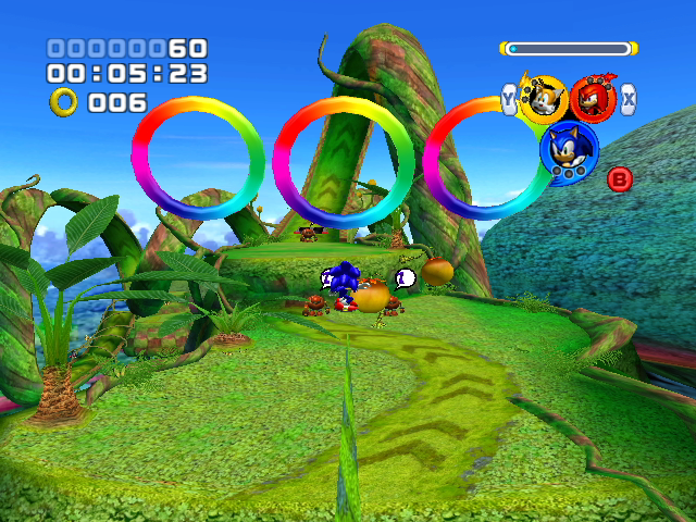
The
interface is quite simple for this game. In the top left corner you
have your score, time and ring counter, and in the top right you have
the game logo doubling up as an indication of what character you are.
The designs are simple and easy to understand, which is good since
the intended audience is around 3-13. Since the intended audience is
young and the games are rather childish the use of bright primary
colours is a good choice. I like this design because it is simple and
easy to use, but it's a bit boring and clunky looking. I intend to
make a smoother more modern looking interface. As well as just
looking at Sonic Heroes, I looked at interfaces from other Sonic
games as well.


The
designs are even simpler, although the last two work better than the
Heroes interface as the white numbers have some sort of frame, which
looks better than just slapping the numbers straight on the screen.
Also the numbers being framed helps make the numbers stand out
against the background.

A
similar series to Sonic, Crash Bandicoot has a similarly simple
interface, but it is much less effective. While the symbols are
easily understandable the text is in a horrible childish font which
just looks unprofessional, and gradients just make it worse. Not only
that but it also takes up nearly 1/4 of the screen, this just shows
how important placement is, and sometimes it’s better to just stick
with the basics.
Picking up
on my favourite aspects from the various interfaces I made some
thumbnail sketches.


After
finishing the sketches I did some beta testing. People liked the way
I had made the three circles into segments of one circle, especially
on the first two thumbnails. As for the score on the left no-one
really liked the second one, there was too much white space
in-between the time and score and all in all it just looked neater in
a box. I decided on the first score-box because it was more elegant
than the block-like 3rd option.


No comments:
Post a Comment